Useful resources for finding and selecting dividend growth stocks
02 October 2018Over the last few years, I’ve expanded my investment strategy to include dividend growth investing in addition to index fund investing. Here are several websites that I use for finding and selecting dividend growth stocks. Many of these sites are not limited to only dividend growth stocks, but are great for general security analysis as well.
List of resources
David Fishe’s CCC List
Link: http://www.dripinvesting.org/tools/tools.asp
David Fishe originally created the CCC List which is now maintained and updated monthly at dripinvesting.org. In order to understand what the CCC list is, it is helpful to know what the Dividend Aristocrats are.
Dividend Aristocrats are members of the S&P500 that have increased their dividend payouts for 25 consecutive years or more. Studies have shown that companies that increase their dividend payouts have better returns and do so with less risk than companies that do not. Dividend Aristocrats are reevaluated each year so that companies reaching their 25th year of consecutive dividend payment increase are added to the list, while companies that reduce or cut their dividends are removed from the list.
Similarly, Dividend Achievers are members of the S&P500 that have increased dividend payouts for at least 10 consecutive years.
Dividend Champions are companies (not necessarily part of the S&P500) that have increased their dividend payouts for at least 25 consecutive years. It thus follows that all aristocrats are champions, but not all champions are aristocrats.
Dividend Contenders are companies that have increased their dividend payouts for at least 10 consecutive years.
Dividend Challengers are companies that have increased their dividend payouts for at least 5 consecutive years.
David Fishe’s CCC list is a ranked list of U.S. Dividend Champions, Contenders, and Challengers.
Yahoo Finance
Link: https://finance.yahoo.com/quote/AAPL/
Yahoo finance is perhaps one of the most well known and commonly used stock analysis tools, and for good reason. Here are some of the sections that I pay close attention to when analyzing a stock.
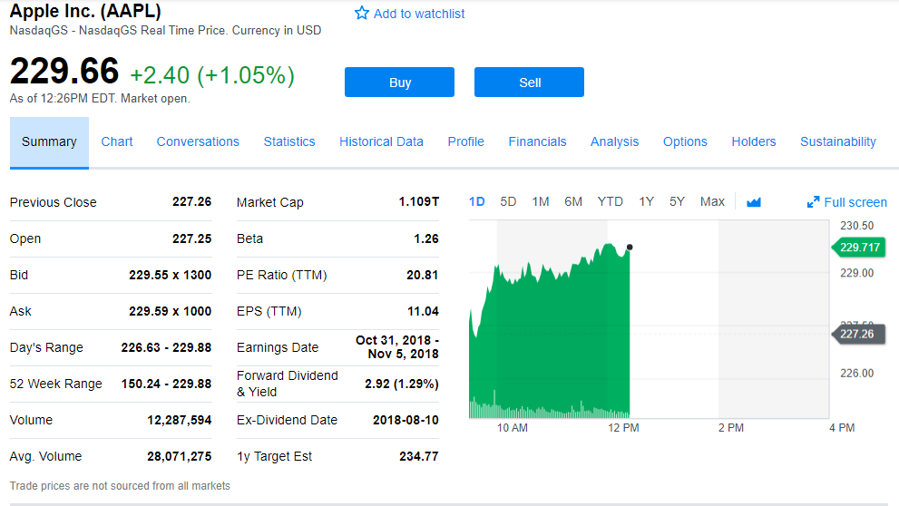
Summary
The summary is pretty straightforward and provides a snapshot of relevant information. From here I can see a snapshot of yield, PE ratio, 52 week range, EPS, and more.
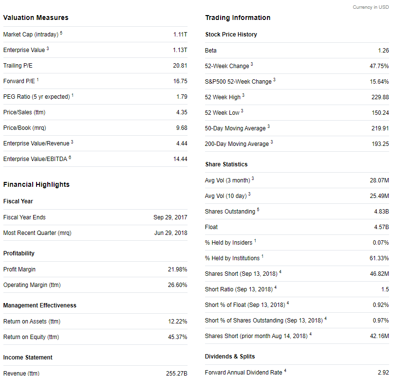
Statistics
The statistics section provides some more detailed information that can be important when taking a closer look at a company. Several price ratios besides the PE ratio can be viewed here.
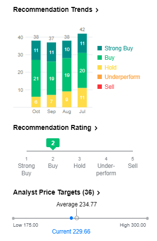
Analysis
I particularly like the analysis section on Yahoo finance. Here you can compare analyst price targets, buy/sell recommendations, and earnings forecasts.
Fidelity
Link: https://snapshot.fidelity.com/fidresearch/snapshot/landing.jhtml#/research?symbol=AAPL
Fidelity has an excellent research dashboard which I use frequently for valuation and dividend analysis. Unfortunately you need to have an account with Fidelity to access the more useful upgraded dashboard. Here are a few of my favorite features from the dashboard.
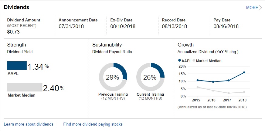
Dividend Analysis
This section works great as a one-stop shop for dividend analysis due to its concise overview of dividend statistics like current and previous dividend payout ratio, yield, dividend growth, and ex-div date. You can also view historical dividend payments by clicking on the “more” button.
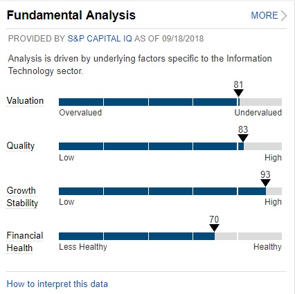
Fundamental Analysis
This section gives me the 10,000 ft. view of company fundamentals and whether there are any issues I should be taking a closer look at.
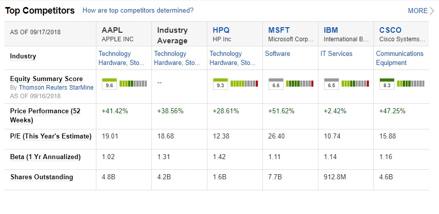
Top Competitors
The top competitors section is another way for me to get a feel for whether the company is undervalued relative to the industry. Be aware that this could be misleading if the entire industry is overvalued.
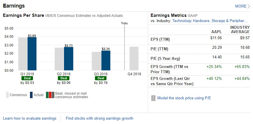
Earnings
The earnings section not only gives me a sense of how this company is performing relative to the industry, but it also gives me a sense of how it is performing compared to its historical average. Comparing the TTM P/E ratio to 5-year average P/E ratio can provide a good indicator for whether the company is undervalued or overvalued and which direction it is heading.
Gurufocus
Link: https://www.gurufocus.com/dividend/AAPL
The Gurufocus dividend research page has some very useful information for dividend analysis and I haven’t found any other website which summarizes it as succinctly as gurufocus does. Here are the main sections of this page that I look at.
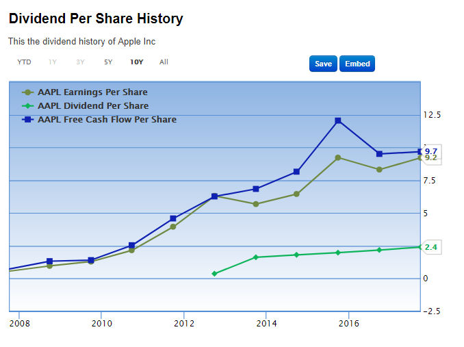
Dividend Per Share History
This graph shows annual per-share earnings, free cash flow, and dividend payout. Just by looking at this chart, I can see that for Apple there is a considerable buffer between free cash flow and dividend payment, which gives me confidence that the dividend payment is safe and likely to grow, even if the company falls on hard times.
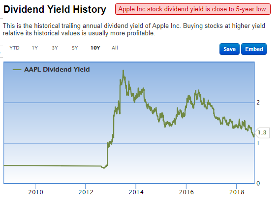
Dividend Yield History
Another graph I like to look at is the historical yield. When the yield is higher than its historical average, it can be a signal that the company is undervalued. Beware, higher yield can also point to more uncertainty or recent challenges which are being reflected in the stock price.
Dividend History
The last section I like to look at on gurufocus is dividend history. From here I can see if dividend increases are accelerating or decelerating, which may require further investigation in either case.
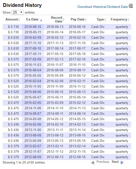
Though less common, special dividends, and dividends that are paid semi-annually, and annually would also be listed here. Special dividends are less likely to continue in the future so I like to know if a significant portion of a company’s current yield is coming from regular or special dividends.
Big Safe Dividends
Link: http://www.bigsafedividends.com/quadchart.aspx
I picked up Charles Carlson’s The Little Book of Big Dividends: A Safe Formula for Guaranteed Returns on Audible, and I think it’s a great starting point for anyone interesting in dividend investing, being that it is short, concise and not overly complex for the beginner.
Carlson’s basic BSD formula says to rank stocks by overall quadrix score and select companies whose payout ratio is below 60%.
The quadrix scores are a proprietary ranking system, but from what I can tell they rank a company’s blue-chip-ness and ability to generate reliable, consistent earnings over the long term.
I don’t really follow the 60% payout ratio rule since I think it can be offset by choosing companies with a proven track record of dividend payment, but I do incorporate the quadrix scores into my own rankings.
Macrotrends
Link: https://www.macrotrends.net/stocks/charts/AAPL/apple/pe-ratio
Macrotrends is a simple and powerful website for checking historical price ratios. Some of the other resources I mentioned provide the trailing twelve month P/E ratio, forward P/E ratio and if you’re lucky the 5-year historical, but macrotrends is the only site I know of that provides a full history of price ratios.
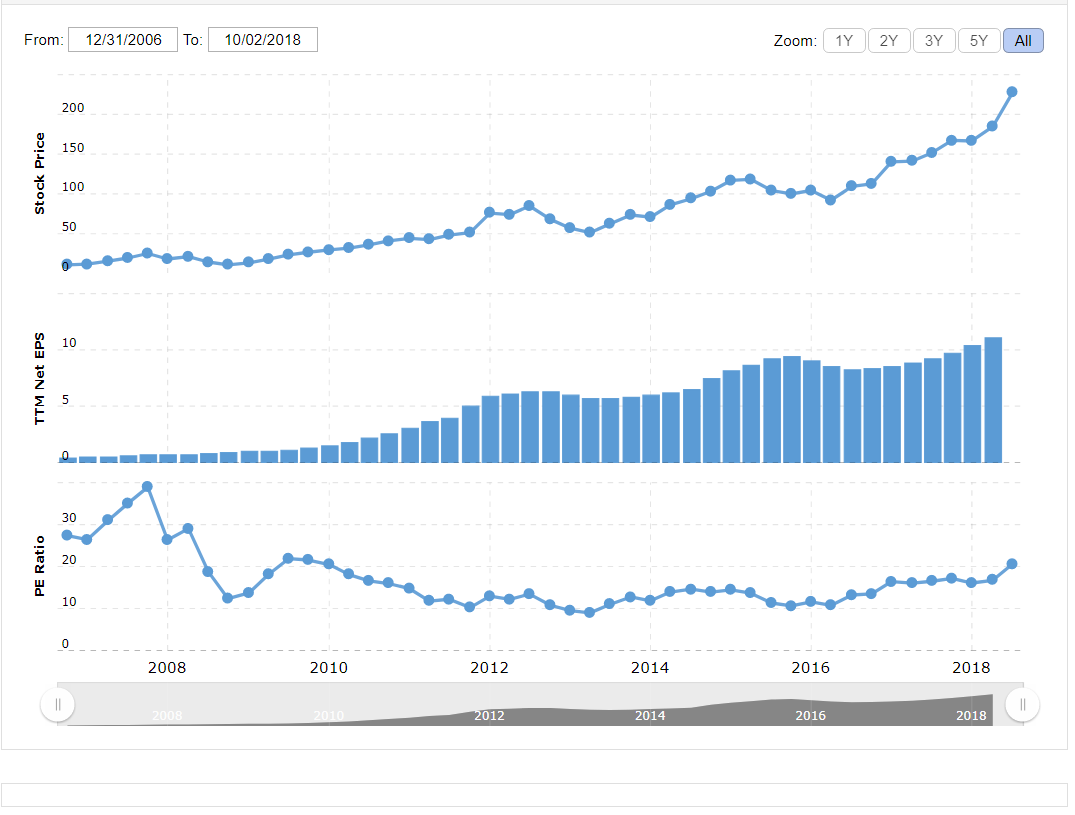
Using these charts, you can see whether the P/E ratio, or other price ratio such as P/S, P/B, is historically low. Again, these are strong indicators that the stock is undervalued.
Honorable Mentions
YCharts
Link: https://ycharts.com/companies/AAPL
YCharts has a lot of useful data, especially for web scraping, but unfortunately this site didn’t make the list since most features are locked to registered users.
Conclusion
Hopefully you found some of this information useful. If you have any feedback or questions, feel free to leave me a comment below.
Happy investing!